Arthur AI X Pokémon
Date 2021
Category Web Design
Services UX/UI design, interface design
Prompt
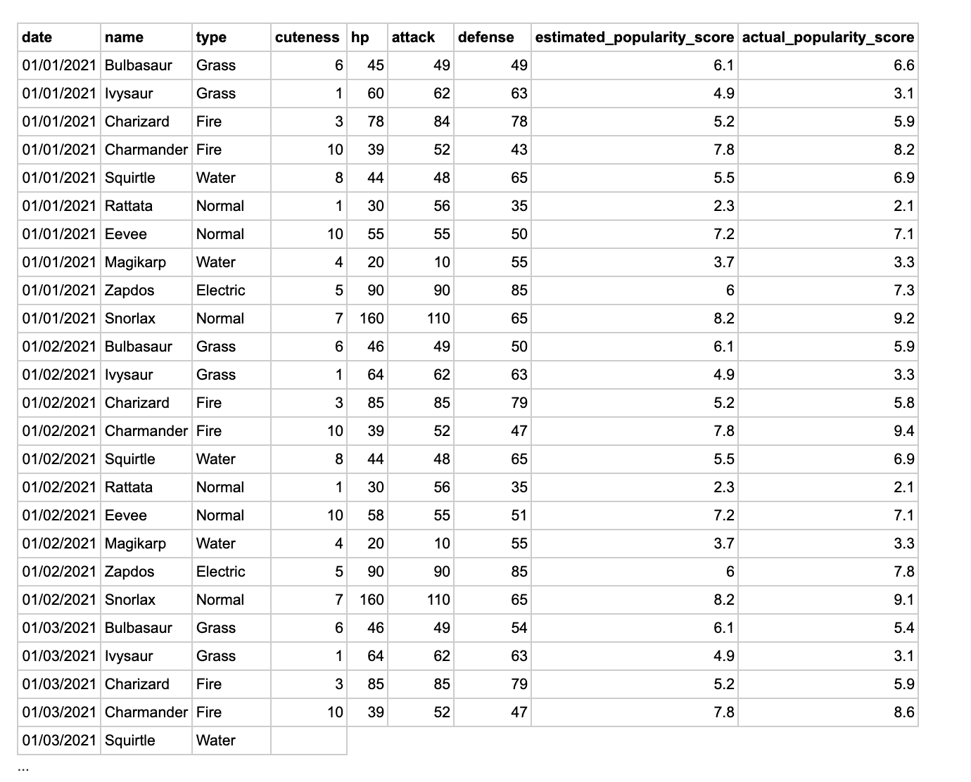
Using the chart data provided below, design a (low-fidelity) dashboard that consists of 2 “components.”
A “component” can be a table, graph, diagram, etc. Think carefully about how the user will interact with the components and, if applicable, the flows between the components.
Along with your mocks, please provide a summary describing the assumptions you made and additional details about user flows that are not clear in the mocks.
Notes
User Intent
Sidebar/Submenus
Data Display
- In a live interface, users should be able to set their intent. Given the chart data provided (pictured right), likely users want to track each Pokémon’s stats and complete their Pokédex. Therefore, there would be options to set user intent for competitive play, Pokédex completition, and a hybrid model of both (as seen in the demo video).
- Some users are more visual-oriented, some prefer lists. In a live version, the dashboard would be accessible to both and allow users to also switch between modes. Or, set specific components to display in a list, or graph.
- The types of dashboard components should also be customizable in live version. Ex: including Pokémon from all 8 generations within the Type Completiton component (chart provided only had Pokémon from Generation 1). Users might want to track how many shiny Pokémon they have, the odds of hatching a shiny Gible with a Jolly nature, or even a Pokémon’s happiness score.
Sidebar/Submenus
- Live interface can scroll vertically (for demo purposes, you can navigate using the circles on the sidebar)
- Likely, the interface will grow as more Pokémon games are released. To add more sections, it would be adding another circle on the sidebar. In a more complex interface that requires submenus, this sidebar solution wouldn’t work. But each tool within the interface is single-purpose, so subdivisions would not be necessary.
Data Display
- Hover over any bar/line in a chart, and it will display the numerical value. I decided to delineate each value with a color to simplify the interface and allow users to summarize stat values quicker (ex: taking time to figure out what a value of 10 means vs. seeing 10 in green and knowing that the stat is good)
- Users would prefer a monospace font for displaying numbers. Monospace means that the numbers will be equal in width (typically this font style is seen in code editors since it makes lines easier/faster to read).
 Note: only the asset provided by Arthur AI was the chart data. No other assets were sent.
Radar Charts
(Cuteness, Est. Popularity and Actual Popularity were stats provided in Arthur AI’s copy. Those values were scaled in proportion to competitive stats HP, Attack, and Defense).
- Users prefer an alternative to radar charts (first chart). Although these types of diagrams are common within Pokémon’s UI, they can become difficult to read.
- As an elegant alternative, I chose to display these stats in a stellar chart (second chart).
(Cuteness, Est. Popularity and Actual Popularity were stats provided in Arthur AI’s copy. Those values were scaled in proportion to competitive stats HP, Attack, and Defense).


(Pokémon’s chart left pictured, stellar chart pictured right)